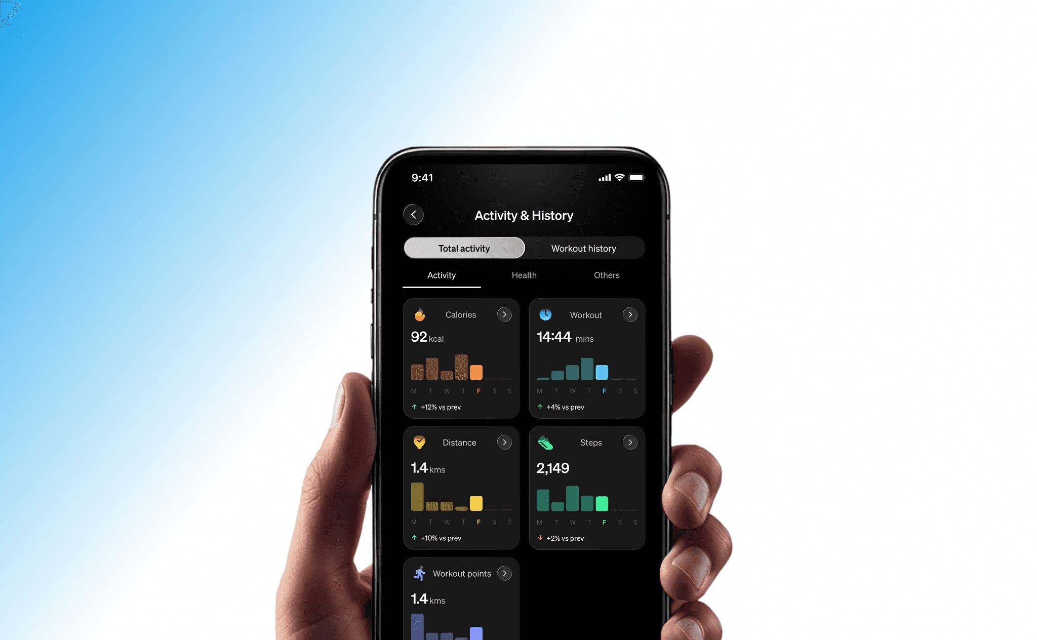
Sportstech Live 2026
Making fitness progress easier to understand at a glance
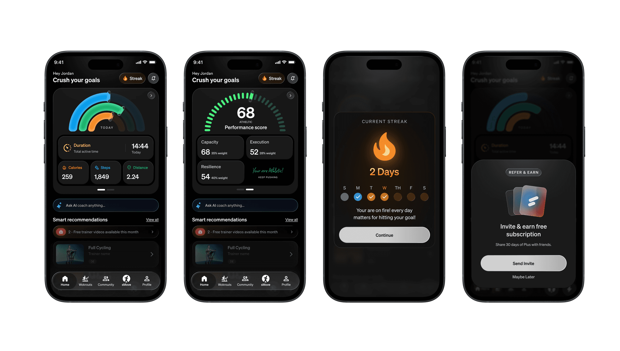
Redesigned key areas of the STL app’s Home section to help users better understand their fitness progress, discover relevant insights, and stay motivated to achieve their goals.
- Role
- Product Designer
- Timeline
- May 2026
- Team
- 1 Designer
- Platform
- Mobile application
Problem
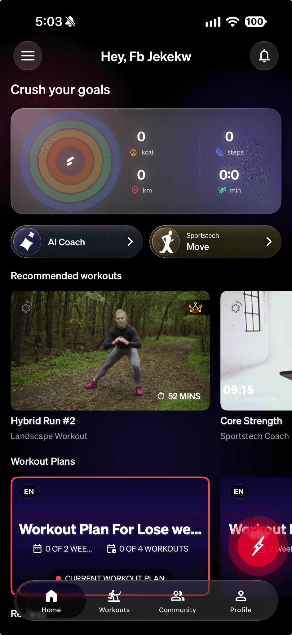
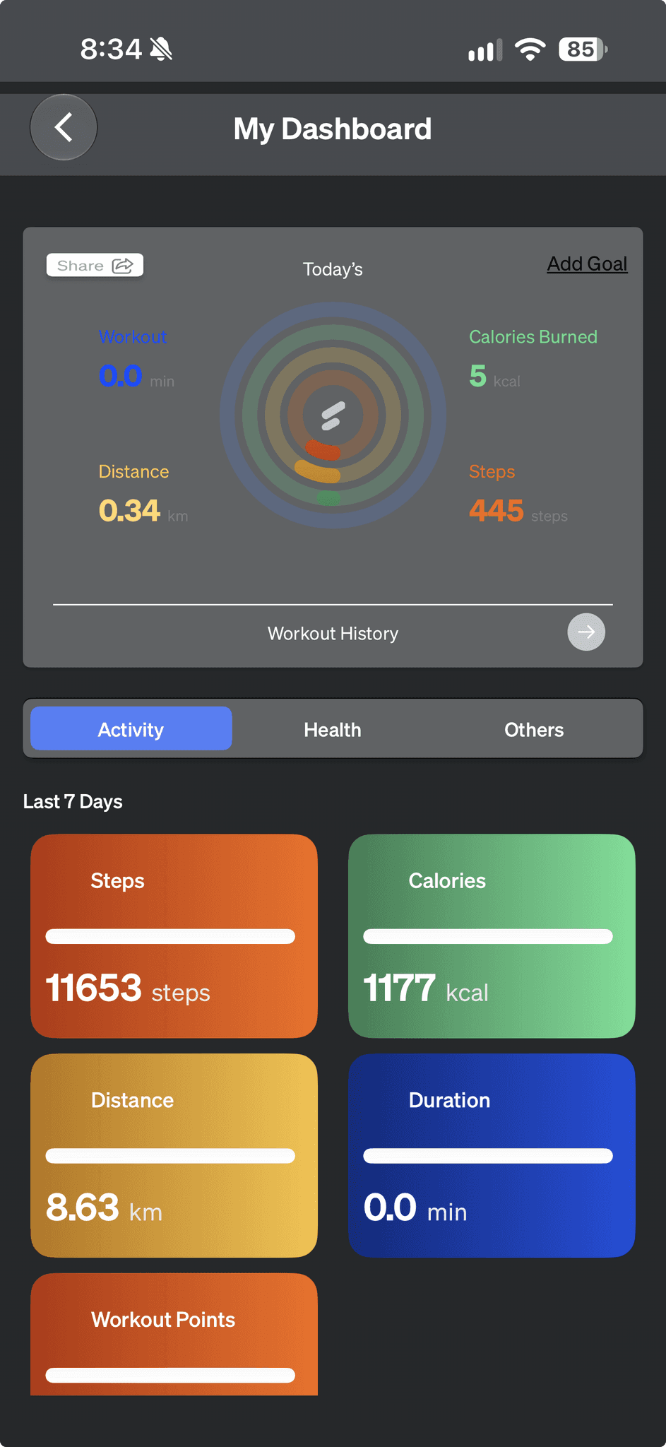
Fitness insights were difficult to understand at a glance
The Home section presented important fitness information, but users needed a clearer way to understand their daily activity, track overall performance, and recognize their progress. Key metrics lacked a unified visual experience, making it harder to quickly interpret results and stay motivated.
Designs
Redesigning the Home experience around progress and motivation
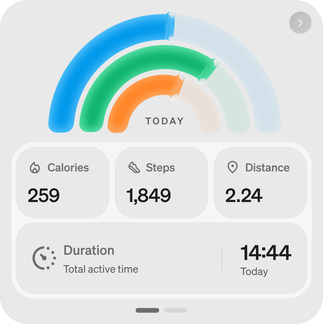
The redesign focused on creating a more engaging and intuitive Home experience through clearer visual hierarchy, simplified metrics, and meaningful progress indicators. New features such as Performance Score and Streak Activity helped bring fitness achievements and daily consistency into focus.
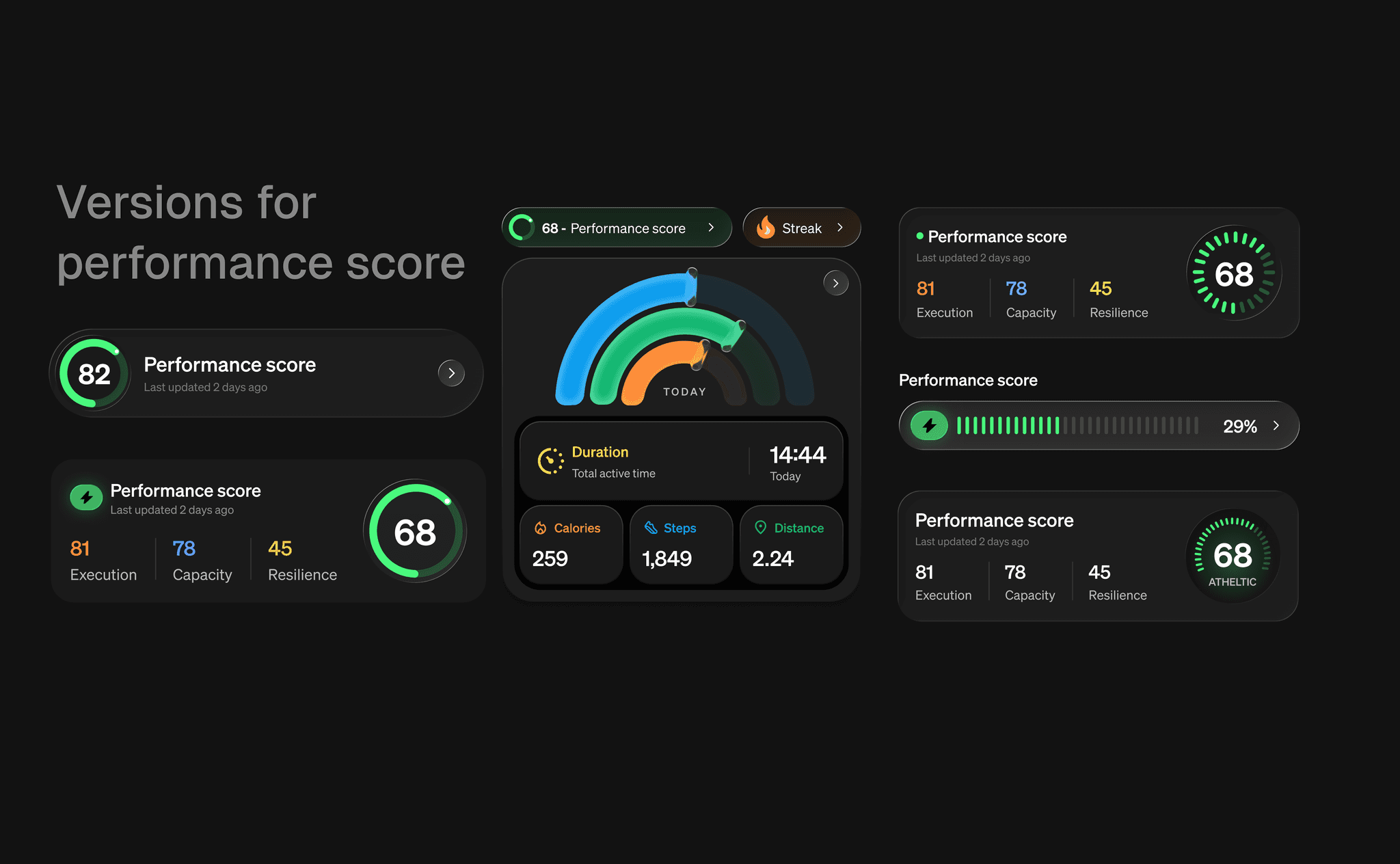
Onboarding and existing users
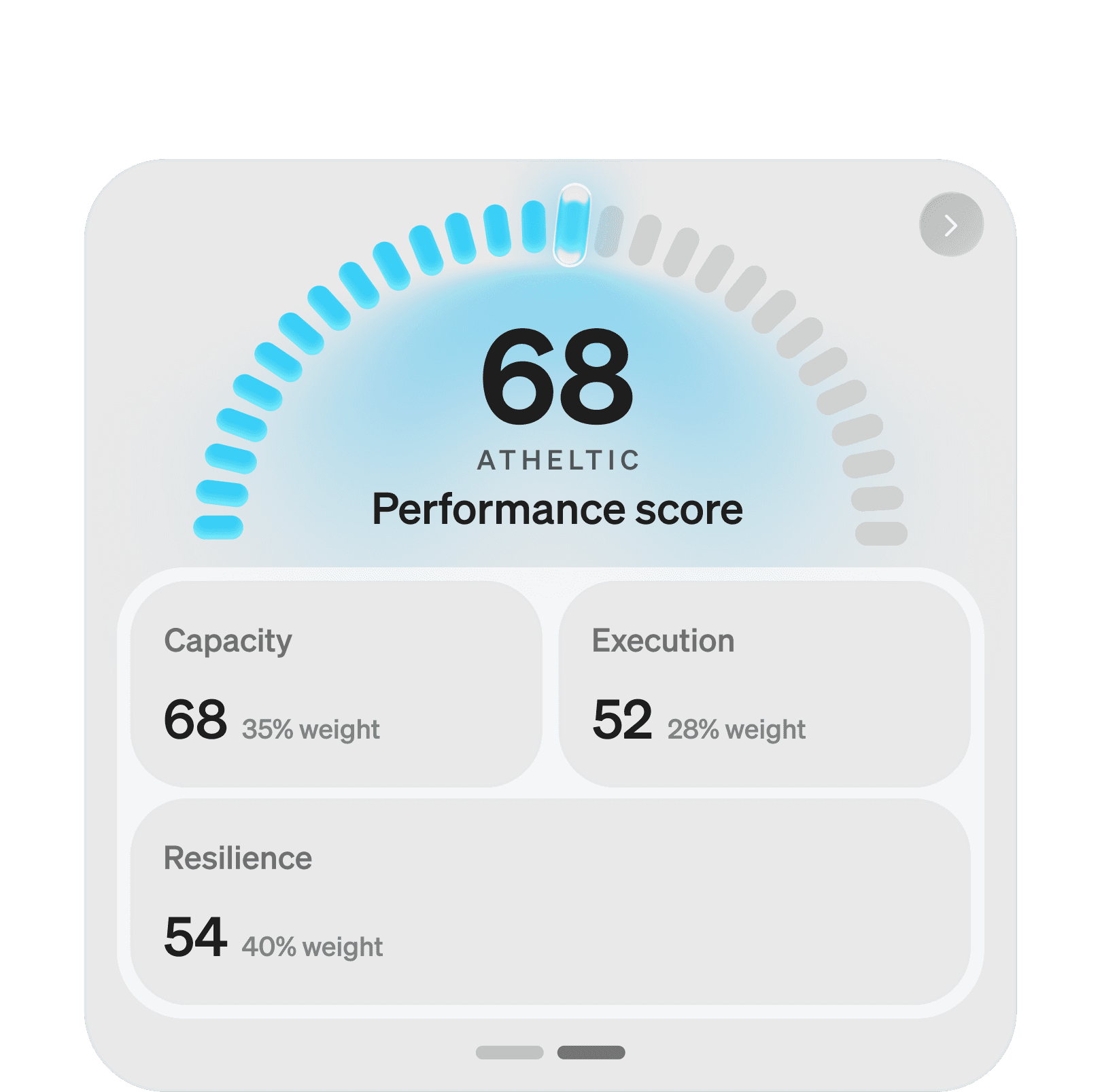
Performance Score
Introduced a new 0–100 Performance Score to give users a clearer understanding of their overall athletic performance. The score brings together key dimensions such as Capacity, Execution, and Resilience, helping users recognise their strengths and track progress over time.
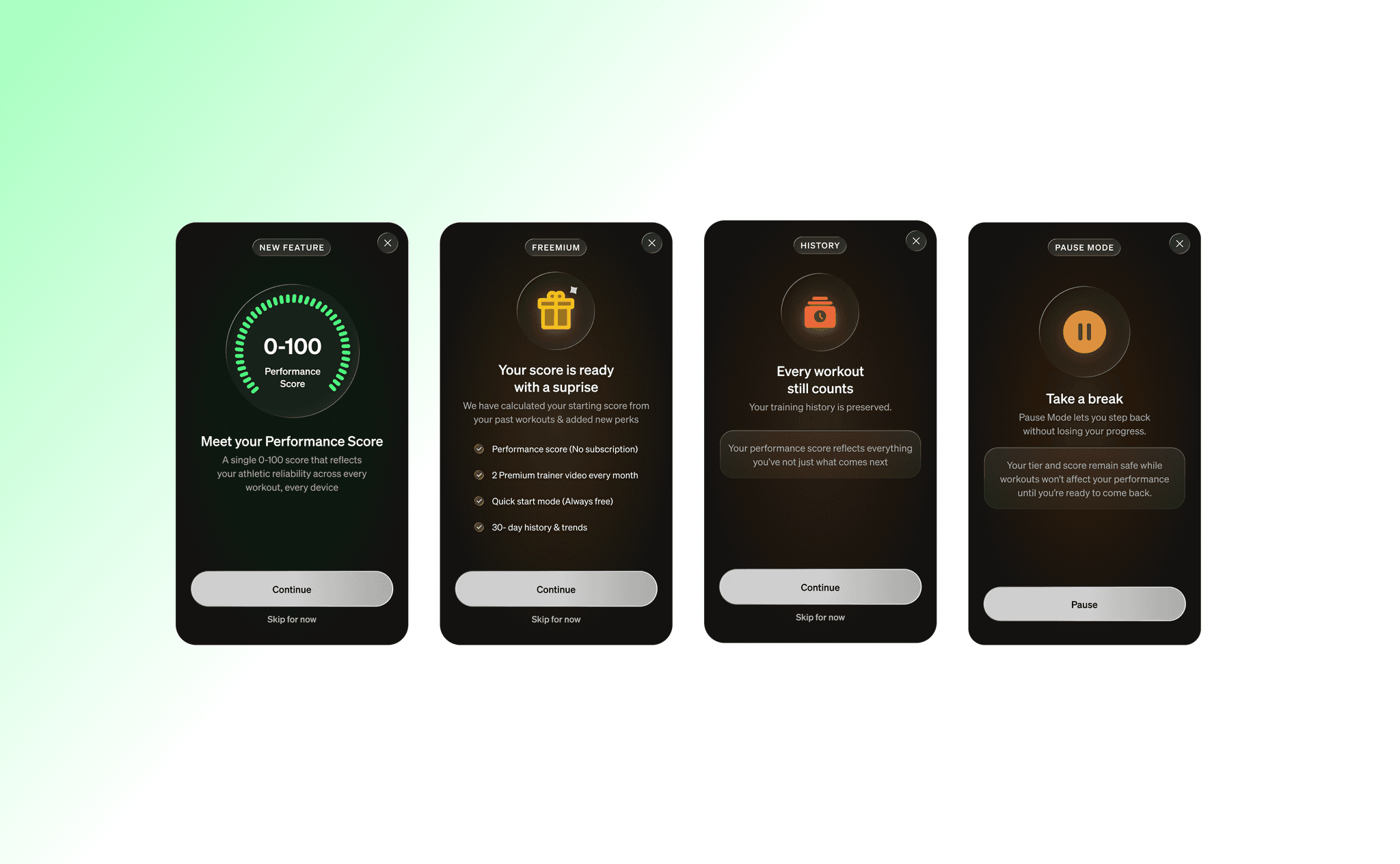
Onboarding: Performance Score
Designed a guided onboarding flow to introduce the Performance Score and explain how it works. The experience communicates the value of the feature, highlights premium benefits, and reassures users that their previous workouts contribute to their score.
Pause Mode
Introduced Pause Mode to give users the flexibility to take a break without losing their progress. The experience communicates how users can temporarily pause their fitness journey while keeping their tier and performance score safe until they are ready to return.
Light theme
Light theme exploration
Explored a light theme variation for the Home experience to evaluate how the app’s visual language could translate beyond its dark interface. The exploration focused on maintaining the clarity of fitness metrics, preserving the visual impact of the activity rings and Performance Score, and creating a softer, more approachable experience while keeping the core design language consistent.